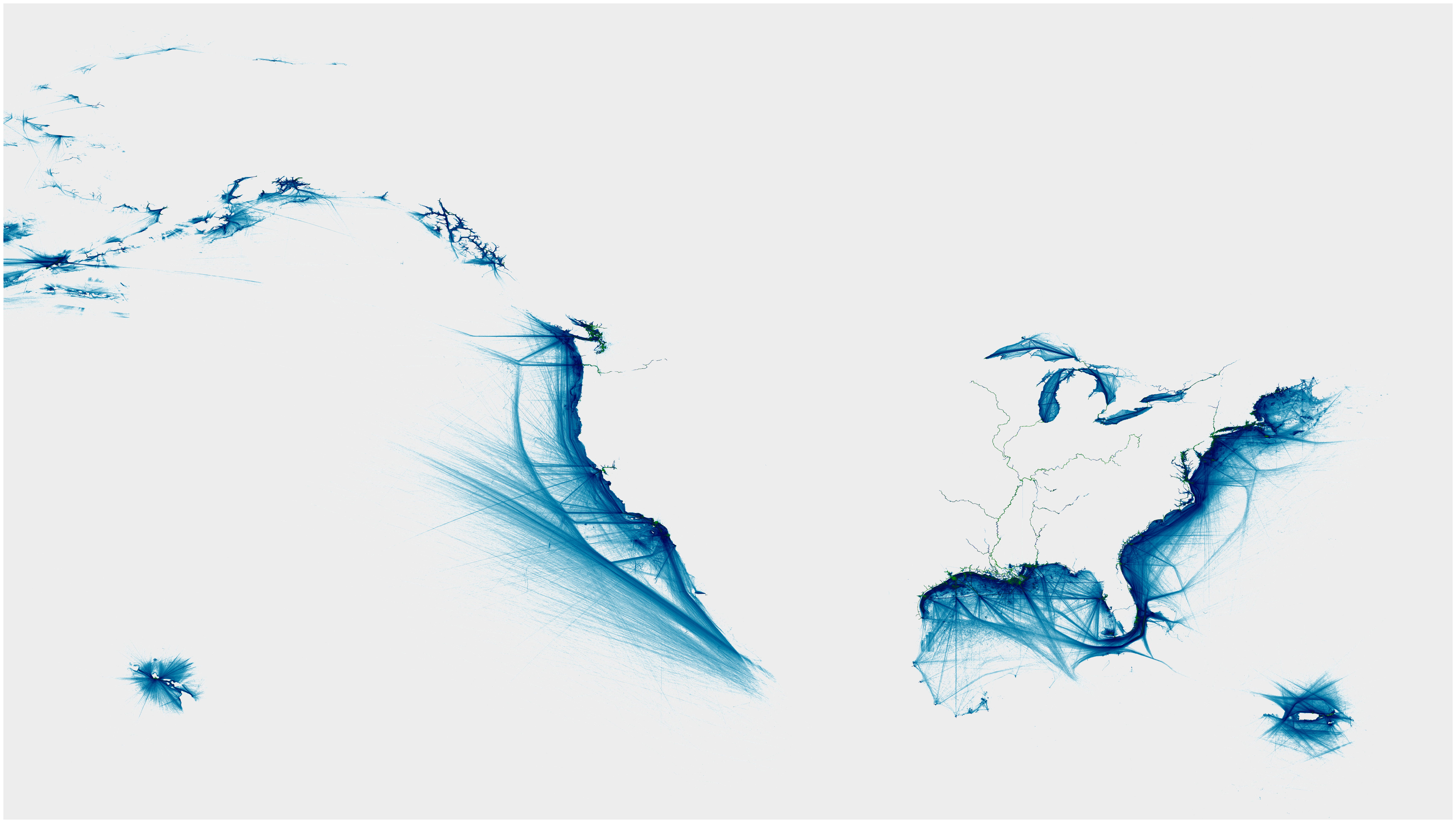
The ocean is most often seen as an empty space, for example in maps, where it is most often depicted as a blue shaded area next to colorful lands, mountains and valleys, forests and deserts, towns and roads. This is due to the traditional approach to creating maps and thinking about landscape (the clue is already in the term), people going as far as they can and writing about the things they find. The ocean in contrast is an inhospitable place to wander for humans, only with the aid of devices such as boats it becomes possible to leave the shore, creating the image of a vast desert in our minds.
In a recent publication we decided to turn this idea on its head. The map you see here is not drawn by people walking how far they get and mapping what they encounter. It is created by boats, more specifically by the Automated Identification system AIS. AIS is a way for ships to communicate their current position to everyone around them to avoid accidents, but the data can also be used to improve our understanding of the marine environment.
Here we did something simple, I created a grid on the scale of 1/60 of a Degree in Latitude and Longitude and counted up the number of vessels that visited every cell of the grid over one year.
To our amazement the visualization on the small scale can tell us a lot about the ocean that surrounds us and the way people engage with it. Join us in the next couple of images that draw into question the view of the empty and boring space.
We will highlight a couple of key features on each but this is just a selection. If you find a feature and have an idea what it could be we invite you to tell us.
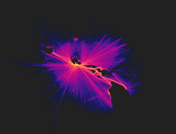
This is a picture of the Hawaii Archipelago, the boats draw a precise outline, especially Honolulu does pop out. What becomes very visible is the connections between the islands in the form of the bright lines of the ferry services. Another feature is the long distance connections over the ocean pointing towards major ports in the far distance.

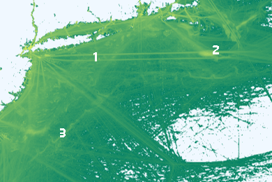
Here you can see the East coast of the United States, all the way to the left here New York city can be found. Even more than in the picture of Hawaii the organisation of traffic becomes apparent, commercial shipping has to follow corridors in proximity / near in vicinity to the land that function much like roads with one lane for each direction. There is no road signs or designations out at sea though, just agreed upon areas for shipping. In the upper right we see the first strong interconnection between nature and human use. The “searchlight cone” (1) out at sea are boats undertaking whale watching starting at Rhode Island. To the south a winding line (2) can be found that represents the delineation between two mighty currents, the Labrador stream coming from the north and the Gulfstream coming from the south. This is fascinating as we do not use anything but AIS data for the creation of the image. The reason we can see this is fishermen who follow the greater amount of fish that position themselves right on the intersection between the water masses.
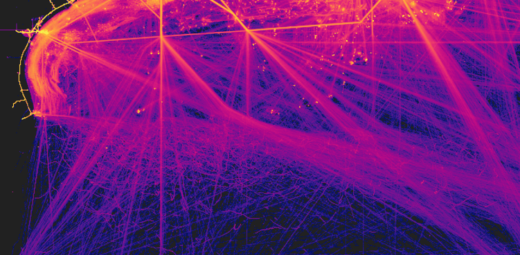
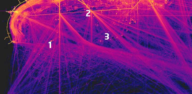
Here we see the difference between administrations, there is a line running through the middle of the picture(1): Below is a weave of smaller lines, above it straight lines seem to prevail. This is the border between the Exclusive Economic Zones of the United States and Mexico. Fishing is far more prevalent in Mexican Waters While the US is dominated by the corridors of trade vessels (2). Out at sea there seem to be small spots of activity (3), these are generated by deepwater oil rigs and the tanker vessels visiting them carry the crude oil to land.
Original Publication
Müller O J, Peters K, Gross T. (2023). Ship map by-catch: research discards and their potentials. you are here: the journal of creative geography, 24.
https://sites.google.com/view/edenkinkaid/creative-works/countercartographies
